'Dumbo' Production Designer Rick Heinrichs on His 40-Year History with Tim Burton
What we all attribute to being Tim Burton’slook -- the darkly-hued, expressionistic designs that occasionally dip into the fantastical or surreal, with Gothic overtones and a knack for kitschy whimsy – can just as easily be sourced to production designer Rick Heinrichs. Heinrichs was with Burton during the early days at Disney and produced “Vincent,” the 1982 short film that really established Burton as the darkly comic visionary we know him as today. Throughout the decades, Heinrichs and Burton have collaborated, again and again (Heinrichs won the Oscar for his work on “Sleepy Hollow”), including on this week’s “Dumbo,” a gorgeous live action adaptation of the animated Disney classic.
We were lucky enough to sit down with Heinrichs and we spoke about how he was at Disney with some of the original “Dumbo” animators, where his inspiration for the new film came from, and whether or not a part of “Star Wars: The Last Jedi” was based off of popular Disney Parks attraction Star Tours.
What was your sort of relationship with the original?
Well, as you probably know, Tim and I were both at Disney in the early 80s and I saw it as a kid and it registered deeply as a very beautiful and emotional film for me as a kid. And when I got to Disney that I was really able to explore with some of the people who, actually were around at the time, because they were still there -- Joe Grant still there, Eric Larson, several of the Nine Old Men. Ward Kimball was still around. So there was a kind of a connection to be made with the people that we're responsible for doing the film in the first place.
And just getting a sense of them and getting a sense of the new people are coming in at that time. Because this was a time of people like Tim and Lasseter and Henry Selick and Brad Bird. All these great people were coming from Cal Arts into the system at Disney and starting to make their mark. But we are all absorbing the history of it at the time and loved the film.
The idea of I'm remaking it has never been even remotely in my mind. I hate the word remake anyway, but one of the things that they are doing now as you know, is redoing these old titles, the golden classics at Disney. And the reason to do it, I think for all of us, is really to take it some take it, evolve it, develop it, and somehow try to get back into the headspace at the original creators were getting in the, uh, at the time when they first were doing the film and see where you could take it from there.
“Dumbo” was a very simple story and originally, I'm sure if you know the history of it, it was like a roll book or something like that. But from the beginning it was all about a misfit of some kind and that misfit both being rejected and sort of finding his place in the world and allowing his true talent to emerge. Tim's the right director for this since those are themes that definitely resonate with him. And the hallmark of everything I've done with Tim has been that expressionistic visual style.
As so often happens when I work with Tim, he has a shorthand style of communicating both visually using sketches that he does and also some words that he uses. But really he's trying to put across a sense of feeling, which is really hard to put it into words. I've been working with Tim for so long, almost 40 years now that you just get enough to open up the whole concept of what you're doing and explore it deeply. And then Tim's very involved in with distilling that into his vision of what it means.
I noticed that the werewolf in the Dreamland haunted house is dressed exactly like the werewolf from “The Nightmare Before Christmas.” Are there any other references people should look out for?
Well what was fabulous about “Dumbo” was, was not just digging deep into the period, but digging deep into the whole concept of circuses. And before there was cinema, there were circuses and the idea of bringing exotic stories and images and myths and exotically wild animals to the boonies. Bringing the rest of the world to the common man was very much what circuses were all about in this period. So diving into that whole period and extracting from it what we needed so that there was enough of a sense of history and period, although Tim's not really particularly driven by historical accuracy. So once we had that playing field to work within, the collaboration really is about pulling things together that go together and then shaping that.
So, for instance, a Dreamland itself -- there was a Dreamland on Coney Island. It burned down in 1911. So we got deeply into that to see what that was like. It was clear from early on that what we were looking for much more of a sort of a Kansas/Oz kind of contrast between the Medici circus heartland and the Dreamland feel. And with those two diverging elements to contrast with each other, it really meant pushing and stylizing the Dreamland aspect of it and simplifying and making sure that the heartland/Kansas vibe of the Medici circus felt that it resonates emotionally with the viewer whereas Dreamland is just beyond anything. It’s literally a land of Oz.
Tim's done circuses a few times before – was it hard to come up with new circus motifs for him?
Well, I mean, I hadn't done circuses with Tim. I did work on “Batman Returns.” But since then I’d gotten involved with a few different circus projects outside of Tim, so I was already aware of things that I was particularly attracted to and wanted to explore. And actually at that point I understood about putting a tent up and how it's a whole process. And if you look at the, the image of the tent on the upper left there, it's lopsided. It's the idea of the tent as both a metaphor for a lofty ideal that you're erecting. And also I wanted to have this slumped and slightly depressed feel to it as well. It's still trying to put on a good show, but there's something very homey about it at the same time. So knowing how these things were put together and then being able to adapt though the shapes that are created from that into something which is more metaphorical and feels like what Tim was after, that that was the exciting thing for me.
Was there anything from the original film that you want people to look out for in this new version?
There are for sure things that resonate both with the original animated film and ours, when you've seen the films. So when you're in the “Winter Quarters,” well, I call it the “Winter Quarters” because we had more of a “Winter Quarters” at one time … The end of the film shows their own version of a kind of a destination circus in Florida. And what you'll see in that there are a number of elements which are very much inspired and evocative of the original exploration that they did for the “Winter Quarters” in the 30s as well.
In fact, on the side of the barn is the shape of an elephant's head carved out of the stucco. One of the things I really wanted to put across, I kept wanting to hammer this idea of the emotional side of the Medici circus and this Dreamland, the shiny bauble that Dreamland was as opposed to that. So when I was hitting with on top of with that was, and I kept kind of coming back to this in various forms, is a kind of a heart shape to Dumbo because I felt that was the emotional core of our film. And I wanted to make sure that that came across, not to mention it's also resonant with the original animated films.
One very nerdy question to ask you about at the end – on the Blu-ray for “The Last Jedi,” Rian Johnson says that the red planet at the end of the movie was inspired by the comet moment in Star Tours. Can you confirm or deny?
[Laughs] That is not something that I heard directly from Rian and he never wanted to place a time and a place for his inspiration with me. But he didn't need to. I've always thought white and red go together really well. And particularly the visceral quality of slicing through the surface of this mineral planet and having this bloody spray erupt from that was so wonderful and such an amazin choice that he made. He came in with that and we were able to sort of key off that for the whole rest of that sequence.
Why is there so much red in “The Last Jedi?”
It's a very strong metaphorical image. Obviously it's got mortality, death, blood, all of that sort of thing. And at the same time it's a metaphor for life and for things being on the edge there. So when you see the throne room, for instance, it's kind presaging a little bit, foreshadowing, if you will, the fight that happens afterwards. It also felt like the right place to put that character and to make that his characteristic environment.
“Dumbo” flies into theaters everywhere on Friday.
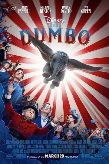
Dumbo

